The Quentin Blake Exhibition

Beth&Matilda

We had a list of things we wanted to do while in London the other week and top of mine was a visit to the Quentin Blake exhibition at the brand new House of Illustration near King’s Cross. Our niece Beth happened to be in the city at the same time and when I mentioned the exhibition she said she’d like to see it too.

It is a small but perfectly formed show, concentrating strongly on a number of books – chief amongst which are Roald Dahl’s The Twits and Danny the Champion of the World, Blake’s Clown, David Walliam’s The Boy in the Dress, and the beautiful and haunting Sad, by Michael Rosen. Blake’s wonderful inky scratches cascade across the walls in the first room, making you feel as if you’ve fallen inside his head! The second room has lots of framed illustrations on the walls, plus cases displaying thumbnail layouts, rough sketches and early character studies, dotted with actual pens, pencils and paints from the artist’s studio. Thrilling! I especially liked the image made for comparing the heights of Sophie, the BFG, and the other giants.

There are insights from Blake about how he approaches each book, whether his own or someone else’s. It was particularly interesting to get an inkling of how he worked with the notoriously difficult Dahl (sounds like a great working relationship), and how he responded to Rosen’s text for Sad, a book written in response to the death of the author’s son. The third room is dedicated to Sad, alone.

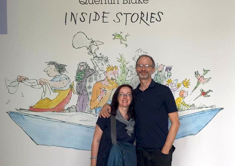
It was fun to walk around the exhibition with Beth as she knew all the Dahl books well and was responding to them both as an art history grad, and as favorite childhood reading – see how her eyes are shining at having her photo taken with Matilda! Michael and myself are big fans of Blake’s and it’s fantastic to see the work in the raw. We drank it all up, watched the accompanying short films of Blake speaking about his work, then headed to the ridiculously cool Caravan bar to recover with a late afternoon tipple!

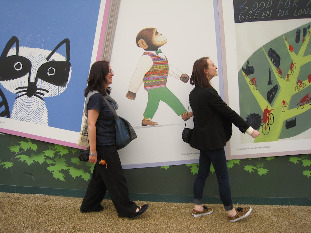
Afterwards, on the way back to the train, we had fun with some the many familiar illustrations decorating the walkway.
Walking with Willy

Walking with Willy the Champ! (Anthony Browne)

QB1Too noisy, ‘Zagazoo’!

The exhibition is on until November 2nd 2014

Link to 2007 article where Quentin Blake talks about illustrating Sad

(Photos mix of ours and Beth O’Rafferty’s)
Holding Pattern…

1795779_10154461125175207_6536724689890180115_n

A blog about not blogging! We were in London last week and, of course, had all good intentions of preparing blogs to go up while we were away, but never got around to it. And this week will be blog-free as well, so here’s a quick glimpse of what’s coming up next week:

The Quentin Blake exhibition in the House of Illustration

London street art (which may even include a Banksy).

We finally get inside the Pollock Toy Museum.

(Photo by Beth O’ Rafferty)

Miss Brooks Story Nook – the art (part 4)


missy 2 jacket finalb In Parts one through three of this blog I talked about creating the art for the children’s picture book, Miss Brooks Story Nook, (were stories are told and ogres are welcome), from the very first sketches, to finished pencil drawings ready for painting.

Below are finished drawings clipped up on my studio wall. You can see two smaller drawings clipped to the top, which is new art for this spread, I decided on after I supposedly had, um,  finished. I try not to do this kind of last minute endless changing, it can lead to madness. I’m never completely happy with what I’ve done anyway. But… sometimes it’s worth it. And this was one of those times. Miss-Brooks-studio-4b

For whatever reason I can only guess at now, I decided to paint the rejected drawings along with the new art meant to replace them. This turned out to be a dumb thing to do, as you’ll see later.paint dots

I used soft, tube watercolors for this book.  start all painting for a book like this,figuring out my palette of must-have colors. For instance, I know for sure all the kids will have skin…, so I start by putting in the skin tones. It’s an easy way to jump into the process without freaking out trying to decide where to start.  In this case a lot of that mock caucasian skin that looks a bit like the color of a Band-Aid. It looks a bit garish but experience tells me put it in stronger than might look right, because once all the other colors are in, if you make it look good alone on white paper, it will look too pale later. And I try to only make the same mistake 3 or 4 times before I wise up…

IMG_0246b

I mix the colors I will definitely need ahead of time – hopefully enough for the entire book. I’ll use good, expensive paint and brushes, and nice porcelain pots like the one above. (I think I might have stolen that one from my father years ago). It never pays to scrimp on materials. You always regret it.

I’ll mix skin colors for the main character, Missy, first, then certain specific colors for her blue overalls and the pink and green stripes of her hat, that have to be used as they are from the previous book. Then I’ll paint them all at once, so they look consistent throughout the book. I can spend an hour painting little green stripes. That’s why I put all the art up on the wall. So I can scan for every place the striped hat appears. And Yes, I do screw up sometimes and somehow not notice one stupid hat and have to try and salvage dried up paint to match it with the other hats as much as possible. IMG_0260b

It can be frustrating to not have a single finished painting until the book is all done. But it’s the only way I know to do it without color shifts.

Below you can see one of my aging brain tricks, which is to mix colors and label them since I forget instantly what exact colors I used for something. And it even matters what brand of color you use. Rembrandt Rose Madder Genuine will not mix the same way as Windsor and Newton Rose Madder Genuine. No two colors are exactly the same, and mixing the exact same color twice is practically impossible, which is why I mix a bunch of some color I plan on using. If I do run out, I can try and remember what I used. IMG_0240

As you can see first I did Missy’s skin, hair, then the striped hat, blue overalls, and Billy’s skin hair, and turquoise track suit. Then the rest of the colors.

IMG_0259

Below is the final color painted art. The scarf is in similar colors as her hat, but it was OK to paint them at different times, because they are not the same. The top image is not going to be used in the final book , but, as I said before, I painted them anyway.

MissBrooksStory-color-1034b

And below is the right hand page of the spread. It’s particularly important to make sure pages that will be seen together, if they have the same character, in the same clothes, they need to be the same.

MissBrooksStory-color-1035b

Below is the first printed proof for the book, with my notes, and with the wrong art on the top left. And it’s all because I inexplicably painted it in. Someone naturally assumed this was the correct art. Who wouldn’t? I covered it with a piece of paper taped over but it wasn’t enough.

Story Nook FG notes031b

Below is the final, fixed spread as it appears in the book with the new art on top.

missy blog001b

By the time the book is finished, the studio is a mess, with palettes of color mixed paint, and test paint papers all over. A contrast to the small pile of neat illustrations to be mailed to the Knopf art director in New York.

IMG_0304

See also:

Miss Brooks Story Nook – book page

More on the art for this book:

Miss Brooks Story Nook, The Art – Part One.

Miss Brooks Story Nook, The Art – Part Two.

Miss Brooks Story Nook, The Art – Part Three.

Miss Brooks Story Nook – the art (part 3)

missy 2 jacket finalbIn parts one and two of this blog entry, I  talked about creating the sketches and then the finish pencil drawings for the children’s picture book, Miss Brooks Story Nook (where tales are told and ogres are welcome).  In this segment I’ll talk more about bringing the art closer to the finished, full color, printed artwork, some abandoned ideas, and evolving final layout.

Below are the finished pencil drawings for the spread in the book I’ve been using as an example. The scene is near at the end of the book, where the main character, Missy, confronts her nemesis, Billy. One of the themes of the book is about the power of storytelling.  As you can see, there is an element of fantasy in the book, where Missy’s story telling is meant to be so vivid it comes alive. This was a complicated idea to illustrate, but it happens a lot in children’s books so I’ve had experience dealing with it before.

Miss pencil spread blogMissy snake 2 blog

Missy, who is telling a tale about her neighbor’s snake she has been given as a gift, needs to be seen as both, “giving Billy her best ‘snake-eyed’ look”, but she cannot actually turn into a snake because I was told she couldn’t. At this point I can’t remember who rejected that idea, there are so many back and forth exchanges when I’m creating the art with the editor, designer, author (and possibly sales people). but it was one of many ideas that was shelved for one reason or the other.

But you can see in the finish drawing and sketch to the right, I still used the “snake-eye” idea as a three part point of view sequence, but removed it and any other suggestion Missy has become part snake. So I ended up using just two visual interpretations of Missy manifesting a snake through her storytelling – eyes and scarf.Miss Brooks bw scans057

Missy snake stair blog

In the sketches above and left you can see me working out the extent of cartoon vs. realism for the snake, and the rejected “missy-snake” idea.This one even has a scarf like tail… The snake popping out Billy’s eyes so that they bounce down the sidewalk(pavement) is in the text and in the final book art, but without glasses and hat. I rather like the Missy snake. It certainly looks nightmarish enough to scare away a thuggish brute like Billy.

The scene to the left is also in the book but again, the snake is not wearing a Missy hat and glasses as here…

Then there was a idea of what the snake was supposed to do to Billy. Before the text changed to popping his eyes out, it was a basic, “It’s gonna eat you up!” or something like that. So I drew that scene too. I like the idea of the bully being devoured. Like so many rejected ideas, maybe I’ll get to use it in some other book.

Miss Brooks bw scans011Miss Brooks bw scans012

On Friday, in part 4, the painting begins.

See also:

Miss Brooks Story Nook – book page

More on the art for this book:

Miss Brooks Story Nook, The Art – Part One.

Miss Brooks Story Nook, The Art – Part Two.