Etch-a-Sketch!

We’ve been etching again. I used a sketch of a wolf I made last year at Wolf’s Hollow as the basis for one of my etchings and Michael used some sketches from the baby book he’s working on.

First we scratched…

Then we inked…

Went to the press. Laid down the plate. Rolled…

And revealed.

And started all over again!

And here are our prints:

It’s the second time we’ve attended a day course with Debora Ando. She’s a great teacher, patient and clear and fun. The National Print Museum holds all sorts of interesting workshops. They also have a really great wee cafe with excellent coffee and fantastic food.

Painting with Pixels

Like all my picturebook ideas Owl Bat Bat Owl began super-rough…

1

…before progressing to more coherent roughs, coherent enough for a publisher to decide they wanted it. Actually, I didn’t think this version was ready to be seen but I was visiting Walker Books to talk over an idea and Michael insisted I bring Owl Bat with me too.

Once Walker took the book I had to decide how I was going to make the final art. Because Owl Bat is a silent/wordless story the art needs to be very easy to read and the characters need to be front and centre of all images, their faces and eyes communicating a huge amount of story. I basically designed the images so the branch the owls and bats are on is a stage and the reader’s visual POV never changes. I wanted to use a very simple style and have easy control of the palette so I decided I would colour the art digitally – the first time ever. I did initially think I’d create the line by hand so I tried a few different things, beginning with scraperboard, then trying ink, then pencil:

In the end none worked. With my back against the wall and time ticking I began messing about on the computer, having a go at ‘painting’ the way I paint in acrylics, laying down a rough ground, then over-painting. I used a ‘brush’ that gave me a nice textured look and wielded it in my normal way, using quick slap-dash strokes, and suddenly it all began to work and feel like it was mine.

I also realised I could create a digital palette by referencing images from my previous books, which was a relief as I am a compulsive colour mixer, never using paint as it comes from the tube, always adding at least a smidge of something else to achieve the shade I want. It took a couple of weeks to get used to using an Intuos pad and pen while looking at the screen, then I was away.

11

The art took as long as it would have to paint on paper but I had much more control. Digitally it’s so easy to redo details without messing up the whole piece, easy to change a single colour, to lighten/darken single elements, and for these illustrations (because of the way I designed the images) that control was really important. Ultimately I think I’d have had to paint the images very large to have the same control on paper and many many images would have hit the bin along the way.

12

There were some heart-stopping moments when I thought it had all gone wrong and I wondered what the hell I was thinking trying to learn to make digital art ‘on the job’, but I got there, with some hand-holding from Audrey, Maria and Andrea in Walker Books. Will I be painting with pixels again? Absolutely!

Owl Bat Bat Owl is published by Walker Books tomorrow. Happy Birthday, little book!

Sketches with Wolves!

When we were in Ipswich MA with Barbara and Ed we went to see the wolves in nearby Wolf Hollow. Wolf Hollow is a centre dedicated to educating people about all things wolf and it was fab to see these beautiful animals up close.

I bought some wolf cards to send home. Ed, Michael and myself had some fun doodling on them.

DSCF6921

Everyone got an Ed wolf, a Michael wolf and a Mel wolf…

…and for once the cards got home before we did.


Click here for info on WOLF HOLLOW

Top Notes

pris dad009

I’m not a morning person; Michael is. I come down to the kitchen an hour or so after he’s left the house and check the kitchen table for a note to see whether he’s …

…or…

Sometimes the sketches are seriously minimalist….

pris dad015

And occasionally I may come home late in the day and find Michael’s ….

pris dad012

… down the pub. In this case, with Peter!

Getting the Lead Out

DSCF2495

Sarah McIntyre’s PicturesMeanBusiness campaign is all about highlighting the work involved in illustrating (and why illustrators should always be credited), so Michael and myself thought we’d try and give you an idea of the drawing work we do when developing a picturebook.

Right now I am working on the colour art for a book, all of it on computer. This ‘finished art’ will take me three to four months total, but there’s been a whole pile of hand-drawing just to get to this stage.

In April 2014 there were scribbled ‘thumbnail’ sketches, as I tried to catch the idea which was emerging. Sometime later I began exploring the story’s characters in more detail, filling a sketchbook. Then several weeks were spent working towards a proper full-size dummy.

After a meeting with the editorial team at Walker Books I made a new dummy, taking their comments, Michael’s comments, and my own new thoughts into account. Another round of comments got me to a third dummy/draft and another editorial meeting, at which point I got the go-ahead to begin the final art.

I then sat down and began redrawing the 32 images, this time for scanning into the computer as the templates for the colour art. I traced the previous images, making final tweaks as I went, double-checking details: have I held each of the eight character’s faces/personalities/proportions properly through-out? Have any of them become stiff/lost their energy and appeal during all this redrawing? Is the background detail working? On and on. It took two weeks straight and I drew my way through nearly 1 metre of pencil lead!

Michael does most of his rough work in sketchbooks. He does even more preliminary drawing than I do, exploring characters, poses, expressions, interactions, humour, emotion, trying out lots of alternatives, always seeking out that perfect image. With the book he’s working on now, he’s reacting to and interpreting a text by Barbara Bottner. His illustration style is very line-led so he spends a ton of time on these drawings.

There are around 2235 individual sketches for this book in just four of the sketchbooks below, and there’s another couple of hundred loose sketches lying around the studio.

Michael will trace/tweak the images he chooses for the book, transfer them to watercolour paper, then work the final colour quickly to keep it all light and alive.

PS: If you’re wondering why this post isn’t illustrated with drawings we’re talking about, there’s a certain amount of ‘keeping things under wraps’ involved with books which won’t be out until the end of next year! Watch out for more posts about illustrating over the next few months.

Miss Brooks Story Nook – the art (part 4)


missy 2 jacket finalb In Parts one through three of this blog I talked about creating the art for the children’s picture book, Miss Brooks Story Nook, (were stories are told and ogres are welcome), from the very first sketches, to finished pencil drawings ready for painting.

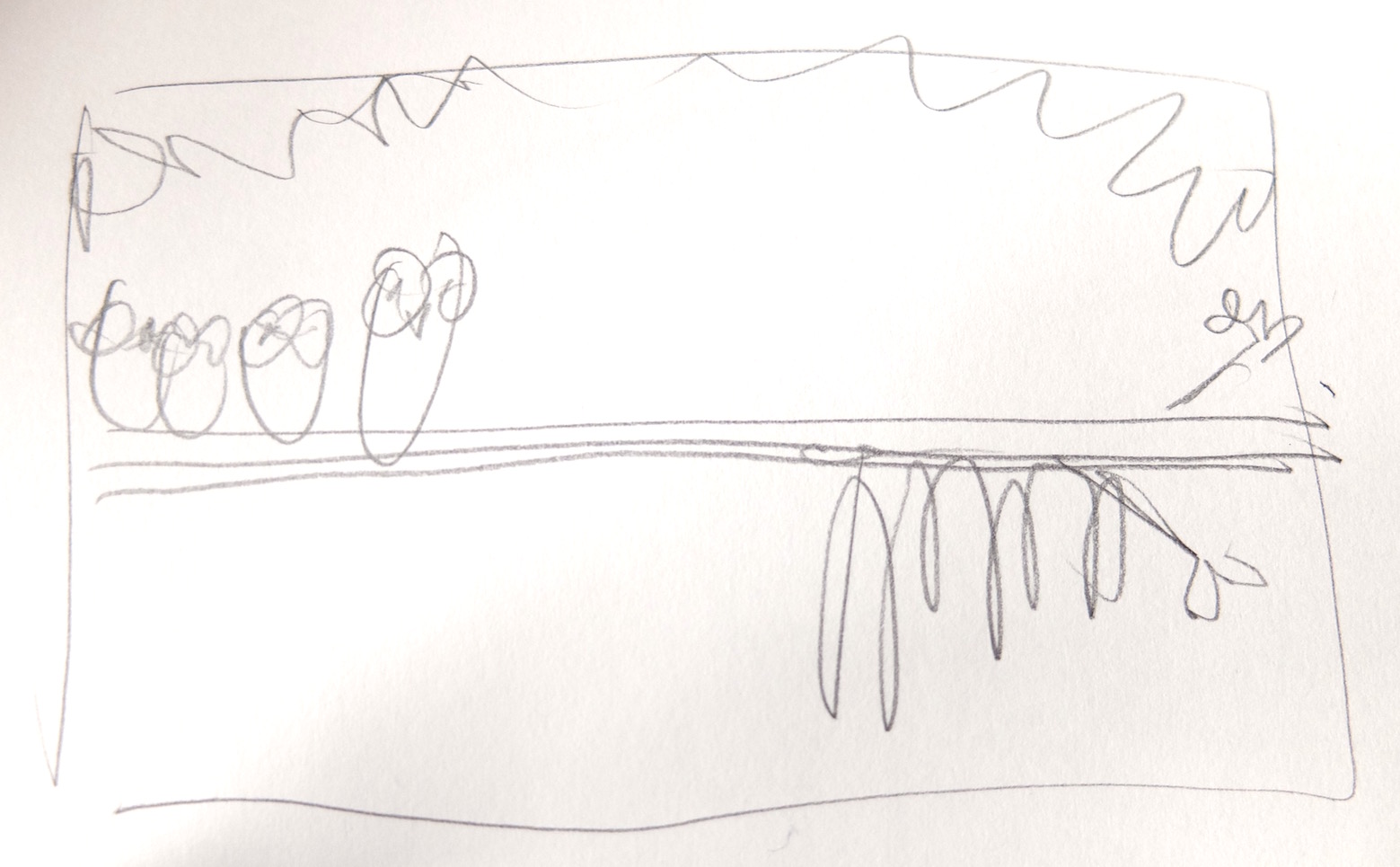
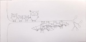
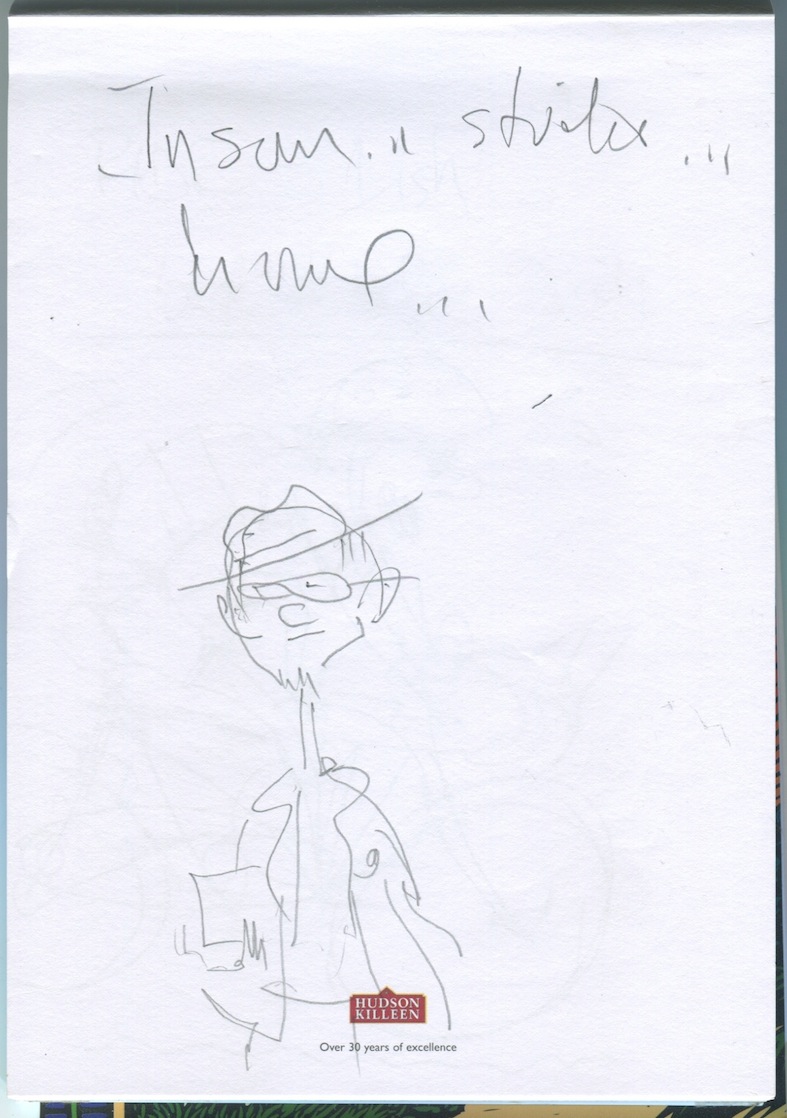
Below are finished drawings clipped up on my studio wall. You can see two smaller drawings clipped to the top, which is new art for this spread, I decided on after I supposedly had, um,  finished. I try not to do this kind of last minute endless changing, it can lead to madness. I’m never completely happy with what I’ve done anyway. But… sometimes it’s worth it. And this was one of those times. Miss-Brooks-studio-4b

For whatever reason I can only guess at now, I decided to paint the rejected drawings along with the new art meant to replace them. This turned out to be a dumb thing to do, as you’ll see later.paint dots

I used soft, tube watercolors for this book.  start all painting for a book like this,figuring out my palette of must-have colors. For instance, I know for sure all the kids will have skin…, so I start by putting in the skin tones. It’s an easy way to jump into the process without freaking out trying to decide where to start.  In this case a lot of that mock caucasian skin that looks a bit like the color of a Band-Aid. It looks a bit garish but experience tells me put it in stronger than might look right, because once all the other colors are in, if you make it look good alone on white paper, it will look too pale later. And I try to only make the same mistake 3 or 4 times before I wise up…

IMG_0246b

I mix the colors I will definitely need ahead of time – hopefully enough for the entire book. I’ll use good, expensive paint and brushes, and nice porcelain pots like the one above. (I think I might have stolen that one from my father years ago). It never pays to scrimp on materials. You always regret it.

I’ll mix skin colors for the main character, Missy, first, then certain specific colors for her blue overalls and the pink and green stripes of her hat, that have to be used as they are from the previous book. Then I’ll paint them all at once, so they look consistent throughout the book. I can spend an hour painting little green stripes. That’s why I put all the art up on the wall. So I can scan for every place the striped hat appears. And Yes, I do screw up sometimes and somehow not notice one stupid hat and have to try and salvage dried up paint to match it with the other hats as much as possible. IMG_0260b

It can be frustrating to not have a single finished painting until the book is all done. But it’s the only way I know to do it without color shifts.

Below you can see one of my aging brain tricks, which is to mix colors and label them since I forget instantly what exact colors I used for something. And it even matters what brand of color you use. Rembrandt Rose Madder Genuine will not mix the same way as Windsor and Newton Rose Madder Genuine. No two colors are exactly the same, and mixing the exact same color twice is practically impossible, which is why I mix a bunch of some color I plan on using. If I do run out, I can try and remember what I used. IMG_0240

As you can see first I did Missy’s skin, hair, then the striped hat, blue overalls, and Billy’s skin hair, and turquoise track suit. Then the rest of the colors.

IMG_0259

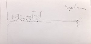
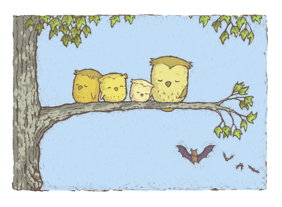
Below is the final color painted art. The scarf is in similar colors as her hat, but it was OK to paint them at different times, because they are not the same. The top image is not going to be used in the final book , but, as I said before, I painted them anyway.

MissBrooksStory-color-1034b

And below is the right hand page of the spread. It’s particularly important to make sure pages that will be seen together, if they have the same character, in the same clothes, they need to be the same.

MissBrooksStory-color-1035b

Below is the first printed proof for the book, with my notes, and with the wrong art on the top left. And it’s all because I inexplicably painted it in. Someone naturally assumed this was the correct art. Who wouldn’t? I covered it with a piece of paper taped over but it wasn’t enough.

Story Nook FG notes031b

Below is the final, fixed spread as it appears in the book with the new art on top.

missy blog001b

By the time the book is finished, the studio is a mess, with palettes of color mixed paint, and test paint papers all over. A contrast to the small pile of neat illustrations to be mailed to the Knopf art director in New York.

IMG_0304

See also:

Miss Brooks Story Nook – book page

More on the art for this book:

Miss Brooks Story Nook, The Art – Part One.

Miss Brooks Story Nook, The Art – Part Two.

Miss Brooks Story Nook, The Art – Part Three.

Miss Brooks Story Nook – the art (part 3)

missy 2 jacket finalbIn parts one and two of this blog entry, I  talked about creating the sketches and then the finish pencil drawings for the children’s picture book, Miss Brooks Story Nook (where tales are told and ogres are welcome).  In this segment I’ll talk more about bringing the art closer to the finished, full color, printed artwork, some abandoned ideas, and evolving final layout.

Below are the finished pencil drawings for the spread in the book I’ve been using as an example. The scene is near at the end of the book, where the main character, Missy, confronts her nemesis, Billy. One of the themes of the book is about the power of storytelling.  As you can see, there is an element of fantasy in the book, where Missy’s story telling is meant to be so vivid it comes alive. This was a complicated idea to illustrate, but it happens a lot in children’s books so I’ve had experience dealing with it before.

Miss pencil spread blogMissy snake 2 blog

Missy, who is telling a tale about her neighbor’s snake she has been given as a gift, needs to be seen as both, “giving Billy her best ‘snake-eyed’ look”, but she cannot actually turn into a snake because I was told she couldn’t. At this point I can’t remember who rejected that idea, there are so many back and forth exchanges when I’m creating the art with the editor, designer, author (and possibly sales people). but it was one of many ideas that was shelved for one reason or the other.

But you can see in the finish drawing and sketch to the right, I still used the “snake-eye” idea as a three part point of view sequence, but removed it and any other suggestion Missy has become part snake. So I ended up using just two visual interpretations of Missy manifesting a snake through her storytelling – eyes and scarf.Miss Brooks bw scans057

Missy snake stair blog

In the sketches above and left you can see me working out the extent of cartoon vs. realism for the snake, and the rejected “missy-snake” idea.This one even has a scarf like tail… The snake popping out Billy’s eyes so that they bounce down the sidewalk(pavement) is in the text and in the final book art, but without glasses and hat. I rather like the Missy snake. It certainly looks nightmarish enough to scare away a thuggish brute like Billy.

The scene to the left is also in the book but again, the snake is not wearing a Missy hat and glasses as here…

Then there was a idea of what the snake was supposed to do to Billy. Before the text changed to popping his eyes out, it was a basic, “It’s gonna eat you up!” or something like that. So I drew that scene too. I like the idea of the bully being devoured. Like so many rejected ideas, maybe I’ll get to use it in some other book.

Miss Brooks bw scans011Miss Brooks bw scans012

On Friday, in part 4, the painting begins.

See also:

Miss Brooks Story Nook – book page

More on the art for this book:

Miss Brooks Story Nook, The Art – Part One.

Miss Brooks Story Nook, The Art – Part Two.


Miss Brooks’ Story Nook – the art, part 1

missy 2 jacket finalbIn my new book, Miss Brooks Story Nook, (written by Barbara Bottner) the illustrations took me over a year to finish. Which is not unusual for me. Why so long? Well, I’m slow, for one thing. But in general the work of illustrating a picture book is not constant. There are several stages you need to go through, from rough sketches of characters, layouts, final sketches, line drawings, then color, with breaks in between for the publisher, (editor, designer), and author to review what I’ve done, and send back comments, which I will listen to, or, ignore. They will listen to me and agree or disagree, and so on, back and forth, until we have negotiated the final look of the book.  Sometimes a decision is made by the author or editor, based on what I’ve drawn, to change the text. And sometimes a change is made to the text while I’m drawing. This all adds time.  So where do I begin? First I read the latest text over and over. Sometimes the editor sends just the written text, and sometimes the text is roughly positioned on layouts in the chosen typeface, as it might appear in the final book. This is helpful as it gives me an instant idea of how much room I have for art, and how the editor sees the page break down. This may remain unchanged, or, more likely, I will change things around a bit. For example, look at a spread below, where the main character, Missy, is staring down her nemesis, a boy named Billy, giving him, as the text states, her best “snake eyed” look. Missy book nook054b I almost always begin the sketch process right on the print-outs of the text layouts. As you can see above, I’m already working on ideas. This is a character I’ve drawn before so I did not need to completely re-create her for this book. The hair, glasses, overalls and stripe hat are a carry-over from the previous book. Missy-BillybNext I move on to sketch books, working at home, or in coffee shops, creating the characters first, then thinking about different scenes each character must “act out”. You can see the date of the above sketch of Missy and Billy, when I began the process – over a year and a half from the book’s publication date of Aug. 2014. This drawing (above) is one of the first sketches I did for this book. This seemed like the pivotal scene of the book, so I’m focusing on it. I still love this drawing, and as usual, I seldom get as good, and as fresh a drawing in the final book as I get in the first few moments of visualizing a story. Sigh. Snake eyes4b Missy book nook014b


Above (left) is the original sketchbook page and the detail on the right of Missy in the “snake Eye” scene. As you can see, I work on many ideas at once. So only one small drawing on this page is from this scene. Notice the unused raincoat outfit for Missy. I love the coat, but there was no room for it. Below I’m trying to visualize the “camera angle”. Notice I’m playing around with the idea of a long winter coat and scarf for Missy. The scarf acting like a kind of snake. Below that I’m developing the idea further but this actually will be the blueprint for the next page, due to changes in the text.

Missy book nook022b Snake eyes 5b               Missy book nook009b Snake eyes 2b

Miss Brooks bw scans001b Snake eyes b Above is a further refinement of the actual image to be used. Focus being on face front, and the view point of the eyes. Below you can see how I developed a new layout with a focus on the eyes/faces of both, in a cinematic “animated” panel sequence for the right page of the spread and a scene, (still desperately trying to get in that raincoat on the left). Changes like this often occur as the text changes because each new spread layout is considered as a whole. And there were more than the normal amount of text changes in this project. Miss-Brooks-Book-Nook-12b(Below) I went back to a face-on Missy on the bottom left, and fooling around with the idea, ultimately rejected, of her wearing a different hat than that in the first book. Also see refinement in the sequence of the two staring each other down… Miss-Brooks-Story-Nook-30-31flatbMiss Brooks final line 009b And here is the final BW pencil drawing for this spread. Notice the stripe hat is back but she is still in a long coat – which will change before the final book is printed, as will the drawing of Billy… More on the finish art in The Art – part 2…

Beginnings…

The-New-Kid-first-sketches

I got the idea for my latest picture book, The New Kid, when I saw a young girl in our local coffee shop, The Happy Pear. The girl was wearing a grey coat. There was something about the way she seemed to be using it to stay separate, inside her own world, that really struck me. I made a few sketches and went home, where the basic bones of the idea started to come through immediatley. These sketches are dated 3/1/10, four years ago. The book was published yesterday, 1/5/14.

That’s pretty typical of how long it takes for my ideas to go from spark to published – they rumble around in the background waiting their turn as I work on other things. I pick them up every now and then, turn them over, add, subtract, change. The finished art takes me about six to eight months and the publisher takes a year to turn it into a book, so it all adds up. Technically yesterday was my new book’s ‘birth’ day, but really that was 3/1/10. For me, now is when it leaves home and heads off into the world! Safe travels, little book.

The-New-Kid-first-text

Looking for Geraldine 2

geraldine-around

Now that I’ve found her, I take a walk around her.

I’ve been sketching Geraldine to become familiar with her, checking how she looks in profile, three quarter face, cross, sad, happy. Next I need to find her a pair of hipster parents and one pesky baby brother…