We often use hot colours in illustrations to make something stand out. You know how it works – cool colours recede, warm colours jump forward. Think of Spielberg using the child in the red coat in his black and white film, Schindler’s List, or of paintings of pastoral scenes which use a red roof or a yellow dress to draw your eye.
Sometimes it’s great to really go for it and use loads of hot colours in one image, or even throughout a whole book. These are the colours of powerful emotions; I used them throughout I am I, which is a story about anger and violence. The palette for it is based on photos I’d taken in Australia’s Red Centre, and Andalucia. Nature is definitely the best starting point for figuring out how to handle fizzing reds, clashing purples and fiery oranges, without ending up in a complete mess!


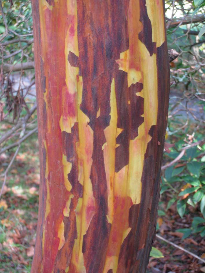
These photos were all taken in Mount Usher gardens where the gardeners are masters of colour mixing. Click on them for full images.
Tuesday’s bouquet of colour will be from a… street car.
