Little Old Ladies

Kisses...

So we were asked recently by a good friend living in Galway, “How would you like to house-sit for a month while I’m away?”

“Sounds good!” we replied. A chance to get away. Do a bit of writing. Perfect. We’re on.

“Oh, and you’d just need to keep these two little old grey-haired ladies company – Ellie and Dinah. Feed them, take them for walks, oh, and, they’ll need to sleep in your bed at night…”

So Ellie and Dinah are dogs, not aunties. Mel has owned several dogs in her life but I’ve never owned one, let alone slept with one. And I’ll admit I’ve been overheard making disparaging remarks about yipping “toy” dogs. So the idea of two noisy, hairy things keeping me up all night for four weeks was a potential deal-breaker. But I agreed. We committed.

Once committed, an “instruction” sheet arrived, outlining fine details like baths, feeding times, psychological history, plus post-walk towel drying and daily arthritic joint massages…

Oh dear.

But as you can see by the photos, after four weeks, I fell for the old gals, their sad history of abandonment and rescue from shelters, their snuffling and twitching at night, their distinct complex personalities. I became so good at sore leg massages they’d fall asleep, and so efficient at a wash and blow dry I could apply for a salon job.

In short, my innate dog cynicism was broken down by these two little old ladies. I got less writing done than I thought, but now we’re home again I still occasionally wake up expecting to hear them snoring softly…

Titles in Translation

If a wordless book gets picked up by a foreign publisher there’s nothing to translate, right? Nope! There’s the title. The chosen title may sound strange or awkward or just plain dull when translated directly, so books can end up with completely different titles in different countries.

I love the sound of Owl Bat Bat Owl – the roundness of ‘owl’ and the abruptness of ‘bat’ fit the story perfectly, and the lack of punctuation helps to keep the emphasis even and flowing. As a title it encapsulates the beginning of the book when the bats are refugees ‘invading’ the owls’ perch, and the end, when they are friends and intermingling.

I love the look of it too – two three-letter words repeated in reverse: Owl Bat/Bat Owl. The word shapes look pleasing together and I was delighted when the designer at Walker Books stacked the words like so:

dscf7538

But the very elements which please the ear and eye in English may get lost in translation so each publisher will make a decision to keep the original title or change it to something which works better in their language.

The Danish publisher chose to translate directly, and you can see how visually different it looks, though it still sounds good (to my ear). The type size has been reduced quite a bit to accommodate ‘flagermus’ and it was set in upper and lower case with some wave action on the words to keep the effect soft.

dscf7544

In the Taiwanese edition the title is Owl Bat without the repeat – the two words take up all the available space. The Taiwanese publishers also requested a change to the cover to allow some text on the left, so I moved the owls over to the right for them.

dscf7537

The Dutch publisher also used this version of the cover and changed the title completely to My Branch! My Branch! Those exclamation marks add vehemence. Much to my delight they flipped the second ‘My Branch’ upside-down. Publishers are usually resistant to flipping text in a title – I know, I’ve tried to get them to do it a few times!

dscf7543

The Italian title reverse translates to something like ‘head up, upside down’, which sounds clumsy in English but looks good and sounds melodic in Italian. When I told my Italian-speaking sister the Italian version was called ‘something su, something gu’ she correctly guessed, ‘Testa in Su, Testa in Giu,’ immediately.

dscf7542

I don’t know what the Japanese title translates as but it’s obviously not direct:

dscf7536

I wonder what it says?*

*Thanks to Mio Debnam and Kris Tsang I now know this translates as ‘Owl Family, Family Bat’.


Painting with Pixels

Like all my picturebook ideas Owl Bat Bat Owl began super-rough…

1

…before progressing to more coherent roughs, coherent enough for a publisher to decide they wanted it. Actually, I didn’t think this version was ready to be seen but I was visiting Walker Books to talk over an idea and Michael insisted I bring Owl Bat with me too.

Once Walker took the book I had to decide how I was going to make the final art. Because Owl Bat is a silent/wordless story the art needs to be very easy to read and the characters need to be front and centre of all images, their faces and eyes communicating a huge amount of story. I basically designed the images so the branch the owls and bats are on is a stage and the reader’s visual POV never changes. I wanted to use a very simple style and have easy control of the palette so I decided I would colour the art digitally – the first time ever. I did initially think I’d create the line by hand so I tried a few different things, beginning with scraperboard, then trying ink, then pencil:

In the end none worked. With my back against the wall and time ticking I began messing about on the computer, having a go at ‘painting’ the way I paint in acrylics, laying down a rough ground, then over-painting. I used a ‘brush’ that gave me a nice textured look and wielded it in my normal way, using quick slap-dash strokes, and suddenly it all began to work and feel like it was mine.

I also realised I could create a digital palette by referencing images from my previous books, which was a relief as I am a compulsive colour mixer, never using paint as it comes from the tube, always adding at least a smidge of something else to achieve the shade I want. It took a couple of weeks to get used to using an Intuos pad and pen while looking at the screen, then I was away.

11

The art took as long as it would have to paint on paper but I had much more control. Digitally it’s so easy to redo details without messing up the whole piece, easy to change a single colour, to lighten/darken single elements, and for these illustrations (because of the way I designed the images) that control was really important. Ultimately I think I’d have had to paint the images very large to have the same control on paper and many many images would have hit the bin along the way.

12

There were some heart-stopping moments when I thought it had all gone wrong and I wondered what the hell I was thinking trying to learn to make digital art ‘on the job’, but I got there, with some hand-holding from Audrey, Maria and Andrea in Walker Books. Will I be painting with pixels again? Absolutely!

Owl Bat Bat Owl is published by Walker Books tomorrow. Happy Birthday, little book!

Same Old Story?

The spark for my new picturebook Owl Bat Bat Owl came from this Christmas card Michael made for me:

dscf7522

One day as I looked at it I thought, ‘bet it would really horrify those owls if another creature moved in on their branch,’ and the idea was born.

As soon as I began sketching my little owls and bats I realised I was riffing on a familiar theme, one I’d explored before in The Long March (1998) and also in I am I (2006), and I was directly referencing this Native American symbol I had come across when making The Long March:

dscf7533

For the Choctaw this is a river symbol*. Gary Whitedeer explained to me that the Choctaw say that just as you cannot stand on both banks of a river at once, you cannot belong to two cultures, but sometimes the river narrows, the banks come closer together and you can reach across and touch someone on the other side.

This idea really resonated with the story I was writing in The Long March.The Choctaw had been through the awful trauma of displacement, which had resulted in huge loss of life through hunger and disease. In 1847, the worst year of the Great Famine, they sent aid to Ireland, reaching across an ocean to help another people going through what they had experienced.

dscf7530

When I came up with the idea for I am I (2006) I quickly realised that I was referencing that river symbol again. The two boys in the story are divided by a river, each yelling about who owns their valley, each full of ego and pride and hate, but when they see the damage their words have done they ‘reach across’ to each other in empathy.

obbo-6-blogsize

In Owl Bat Bat Owl the river is replaced by a branch. The resident owls are horrified when a family of homeless bats turn up seeking refuge in their tree, but then the wind blows up a storm and the two families experience near catastrophe…

I told the story of The Long March with several thousand words and detailed realistic illustrations. I only used a few hundred words in I am I but those words morphed and twisted into barbed wire, a dragon, birds, making it very much a story told visually. With Owl Bat Bat Owl I have dispensed with words completely and the whole story unfolds through images alone.

It is my first wordless book, my first all-animal book and the first time I’ve illustrated a book entirely with digital art, but for all its difference and newness it is indeed ‘the same old story’. I am writing again about displacement, difference, empathy, friendship. The river symbol which Gary Whitedeer showed me in 1996 has run through my work, gifting me story after story, or the same story reimagined. The three books look very different but that river runs through them all.

Owl Bat Bat Owl (Walker Books) will be available on October 6th.

*some Native American tribes see this as a snake symbol.

Sketches with Wolves!

When we were in Ipswich MA with Barbara and Ed we went to see the wolves in nearby Wolf Hollow. Wolf Hollow is a centre dedicated to educating people about all things wolf and it was fab to see these beautiful animals up close.

I bought some wolf cards to send home. Ed, Michael and myself had some fun doodling on them.

DSCF6921

Everyone got an Ed wolf, a Michael wolf and a Mel wolf…

…and for once the cards got home before we did.


Click here for info on WOLF HOLLOW

Corn Dolly

They were teaching folk how to make corn dolls at the Concorde Museum so I had a go. A museum guide helped me through each step.

If you want a closer look, click and scroll. Roll mouse over images for captions.

DSCF6698

Then I placed my corn dolly in an authentic New England window to set her off to best effect!


Photos © Michael Emberley

On Authors’ Ridge at Sleepy Hollow


Louisa May AlcottOn Saturday we were back in Concord MA and made the pilgrimage to Sleepy Hollow cemetery. We passed through the Authors’ Gate, climbed up to Authors’ Ridge and went looking for the Alcott graves. It was nearly 6pm and we had the place to ourselves so it felt all the more special to stand a while at the resting place of Louisa and her Little Women.

Other famous writers buried on the ridge are Nathaniel Hawthorne, Henry Thoreau and Emerson, contemporaries and neighbours of the Alcotts.

Other Little Women posts:

https://thebelugasarewatching.com/2015/11/25/at-home-with-jo-march/

https://thebelugasarewatching.com/2015/12/02/jo-amy-me/

Why 32 Pages?

Picturebooks are mostly 32 pages long for several reasons. One is paper size.

The maximum size sheet of paper a press can take depends on the size of the press itself. However, paper needs to maintain stability as it goes through the press and the larger the sheet in a four-colour print run, the more likely it will stretch slightly as it gets inked, causing the colour to go out of register. So there are limits to how large a sheet of paper is used for a picturebook run.

Depending on its dimensions, a 32 page book may be printed on 1 single sheet (16 individual pages on either side = 32), or split between 2 sheets of paper, each with 8 pages on either side.

The Sleeping Giant was printed on 2 sheets and the images below show the imposition proof of the first section. Because this is a test proof it’s on cheap thin paper. Also it has been rolling around our studio for several years which is why it’s so crumpled and tatty!

Giant-section 1-test sheet Giant-section 1otherside-test sheet I’ve added the page numbers on top so you can see the way the imposition works – the 16 pages are organised on the sheet so they will all end up in the right place when it is folded by the folding machine. Once the imposition sheet has been folded to check this, the print run can go ahead. The imposition print is also called the ‘blue copy’ because it was formerly printed only in blue.

On this close up of the imposition sheet you can see the fold/trim lines which don’t appear on the final printed sheets. Some artwork is ‘bleeding’ over the trim line. Illustrators always add ‘bleed’ (10-15mm) to images to allow for slight shifts when the folded section is trimmed on three sides.

Fold&bleed&trimlines -test sheetPicturebooks are many different shapes and sizes but ultimately they need to fit within a certain size of paper to be competitively priced. Sometimes publishers produce over-size books, or one which is extra tall or extra wide, and some picturebooks are pushed to 48 pages (an extra 16 pages/1 sheet) – but extra sheets mean an extra print-run & time & ink and all add to the cost. Picturebooks also come as 24 pages, 40, 56, but the pages are always in multiples of 8. You can’t add or subtract a random number of pages – say 2, or 4.

The thing is, while paper size and cost may be the main reason why the 32 page picturebook is the most common, it is a length which works very well. A 24 page book is quite short, so is often used for baby books, while 48 pages may feel like the story is being dragged out. 32 pages has a Goldilocks’ rightness to it!


Note for any illustrator thinking of creating their first picturebook: the publisher looks after these technical details of preparing the art for print. Also, they will decide the size and dimensions with you. If you want to rough up an idea within ‘acceptable’ dimensions try finding a book that is a size and shape which you feel suits your idea, and use its measurements as a guide. Bear in mind that paper sizes vary a little worldwide and that the publisher may suggest changes, so don’t get too wedded to an exact size too early in the process.

Picturebook Journey, from idea to published…

…told mostly through images. Click on any image for a closer look.

New-Kid-1
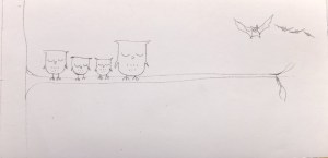
The idea for The New Kid started when I observed a small girl in The Happy Pear coffee shop. Something about the way she was wearing her coat resonated with me, reminded me of myself as a child… the above on-the-spot sketches and first version of text are dated 3rd January 2010.

New-Kid-2Early draft of the text which I printed out and immediately covered in edits. There were many rewrites and edits through-out the process, right up until I sent off the final art.

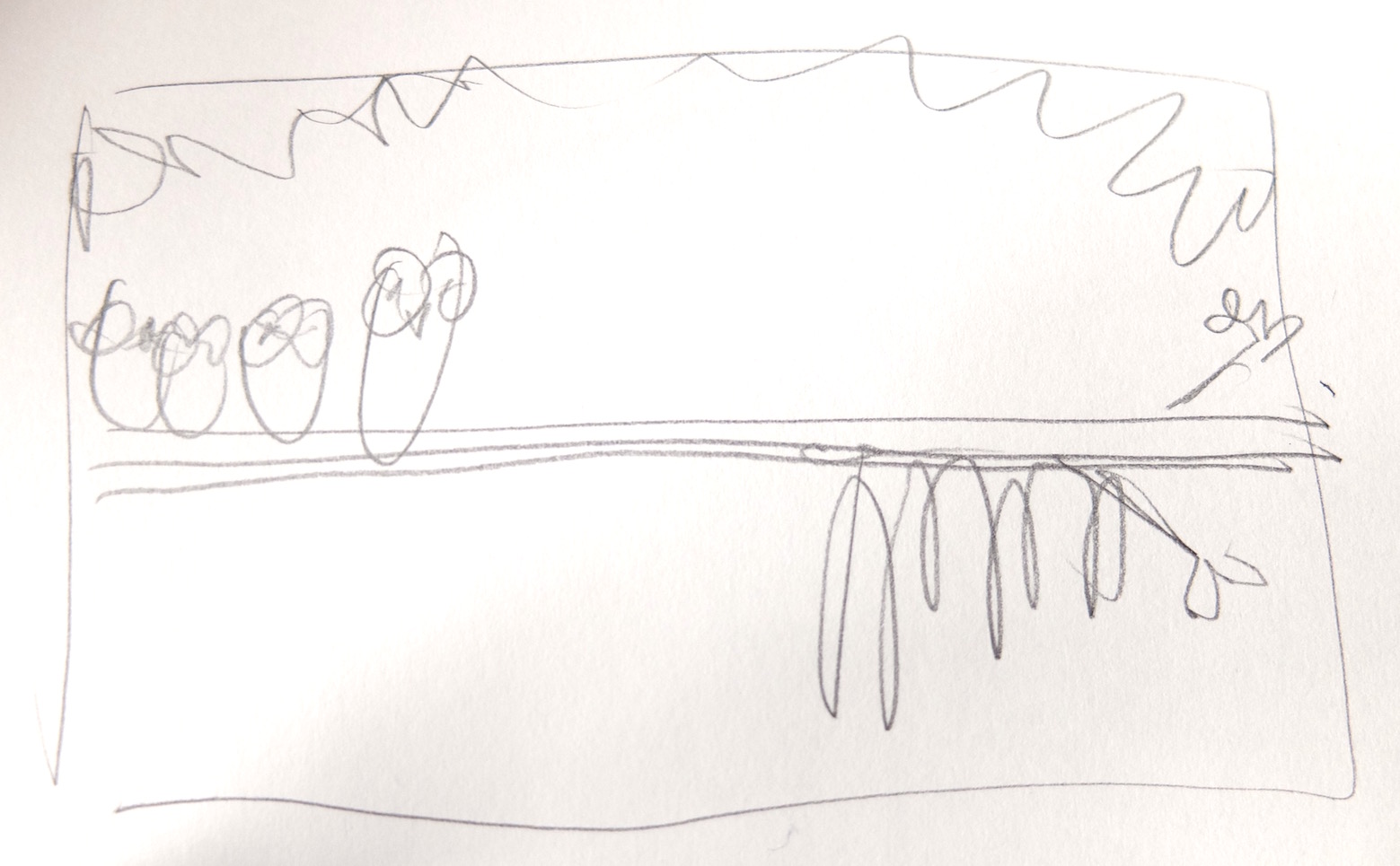
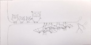
Early thumbnails as I tried to work out the story visually. I did this alongside shaping the text. Again, I wrote notes to myself all over these – change this, change that. These are working roughs, all about getting the idea out onto paper, not about making nice drawings.

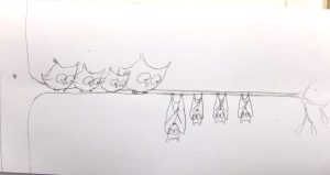
Then I did sketches to find my characters. Ellie is based on the little girl I saw so I had her set from early on. The others had to emerge…

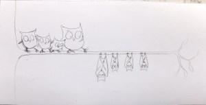
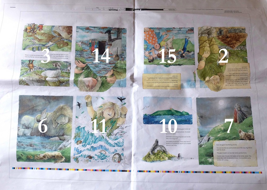
These images are from a set of more coherent roughs – I’m still working small, three spreads to an A3 sheet of paper – but I’m getting closer each time to how the book will look. I did at least three versions of the book at this size, copying the images which were working and changing/tweaking/losing others with every layer of reworking.

When I was happy with how it was working I made up a full size dummy and sent a copy to my agent (now I’d make a PDF and send it too). She showed it to Hodder and I had a contract! Yay! This was, I think, mid 2011. The work described above was done in two/three/four week runs, with gaps in between doing other things.

The editors then sent me comments, suggested some changes, pointed out weak spots…

New-Kid-18…and I took most of these onboard as I knew they would improve the book. One or two things I didn’t agree with, so we discussed and compromised, or I left those out. I did another set of full size roughs, there were a few more tweaks and finally…

…a set of ‘finished’ roughs – a set as close as I could get to the final images before going to colour. Last chance for major changes, so everyone looked at them very carefully. I roughed in the text as already planned with the design editor. Text needs to be placed where it reads well, looks well, and is not too near gutters or edges. There needs to be room to allow translations into languages, such as German, which will need more space. As the text in this book is sitting on the images I needed to make sure I didn’t paint fussy texture or dark tones underneath.

It was finally time to begin the finished art:

I worked in acrylics. It was very labour intensive and took about six months to complete – 15 spreads averaging two weeks a piece (some 1 week, some 3), and of course a few hit the bin along the way.

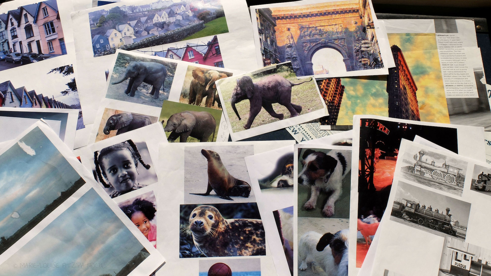
I referenced loads of images as I worked, some to ensure drew the animals/vehicles correctly, others were for colour reference. I had taken many photos a friend’s dog, and of a street in Cobh, other images were from books and the internet.

New-Kid-19

Then came the endpapers and the cover. The cover is very important as it is what makes people pick up the book in the first place – I’ll blog about that journey another day.

I sent off the art by courier and then a month later a set of colour proofs arrived – my absolute last chance to pick up errors in the text and tweak the colours if any of them looked strange. The colours in the final book will never exactly match the art; the best that can be accomplished is a close match with no odd colours. A few changes were needed – a spelling fix on the title spread, one spread looked rather dark, and the skin tones in two  had gone a little peachy.

The book headed off to China to be printed and bound. It can take six months to a year  to arrive back and be distributed to shops. I got my first copies in May 2014, so it had taken 4 years and 4 months from initial idea through to published book. About 10 months work spread out over that time, it’s hard to tell exactly; I was working on other books in between.

7Melfitz

It was a fairly typical picturebook journey for me; other writer/illustrators have different or similar processes and take less or more time. Michael discusses his process here: miss-brooks-story-nook-the-art-part-1

This post is especially for the students and staff at Marino Institute of Education, where I have very much enjoyed being this year’s writer-in-residence.


Strandbeest Strolling

DSCF4837

Our favourite exhibition last year was Theo Jansen’s Strandbeests at the Peabody in Salem. It was so good we went twice. We brought  Barbara (above, walking a Beest) and Ed, and two other friends with us for the second visit.

Fun, playful, intricate, fascinating, poignant – I could fling adjectives at it. We were let play with two little Beests, take them for short walks. A larger Beest was set in motion for us and the crowd gasped as if a baby elephant had trotted into the room. The Beests in motion really are like living creatures. They are quirky and beautiful and complex, and the thinking behind them is too. Click and scroll for larger images.

This link brings you to Theo Jansen’s website and a beautiful video of various evolutions of his creatures, in motion.

DSCF4852