Miss Brooks Story Nook, the art (part 2)

missy 2 jacket finalbIn part one of this post, I talked about creating the art for Miss Brooks Story Nook (where tales are told and ogres are welcome),written by Barbara Bottner,  beginning with the sketches and how they build from the very first loose drawings done directly on the text layouts, up to the final pencil line drawings. Below have a look at the final line drawings pinned up in the studio. The room I am renting at the moment is quite small so I must clip them up on a rack I made so I can see them all at once. It’s important to be able to see the whole book at once to see what may be missing or not up to snuff. And when the painting begins it’s important because I work a little bit at a time from one drawing to another. More about that later… the two color illustrations you can see are test images to show the publisher the look of the final art.

Miss-Brooks-studio-1b

As you can see, I do all the final line drawing at once, before beginning the color painting. One big reason to do this is to try and have the the line work look as consistent as possible throughout the book. Believe it or not, I can draw slightly differently from week to week, day to day, maybe even hour to hour.

Below is the final pencil line art for the spread I talked about in Part One of this blog. I used a 5mm mechanical pencil in a B grade (I think), on cold press Arches 90lb watercolor paper. I use Arches as it’s readily available and there’s nothing worse than running out of paper mid job. The thin 90lb paper is because I use a light table to draw the final art from sketches.

As you’ll see later,  the bottom illustration is final, but the top image will change before the book is published. Both Missy and Billy will be replaced by new drawings.

Miss Brooks final line 009b

Below is the final pencil line art for the right hand page of this spread. It does not change. You can see I’m labeling the art, Miss Brooks Book Nook, not the final title, Miss Brooks Story Nook, but it was the working title I liked best so it was the only one I could remember.

Miss Brooks final line 005b

In part one I followed one spread, the climax of the story, from sketches to final pencil art, in which the main character, Missy, confronts her nemesis, Billy, giving him a serious stare-down with her “snake-eye” look.

Miss-Brooks-studio-4b

Above is the art for this spread pinned up on the wall. Notice the two smaller drawings clipped to the page at left. I mentioned I made a late change to the art? Two things bugged me: one was that long coat – I loved it, but decided it was more consistent to have her wear her easily identifiable blue overalls – and I thought Billy should be showing more of how crazy he was.

Crazy BillyHere is Crazy Billy close-up.(above) He looked a bit angry before, which he is, but his madness I thought was a better way to play the scene. I’m so glad I did make the change. I love “crazy Billy”. Look at him – he’s crazy!

Two Missys

Above are the two Missy drawings side by side. Right is the new/final one. Like the coat on left but decided on keeping her outfit consistent.

Miss Brooks bw scans002b

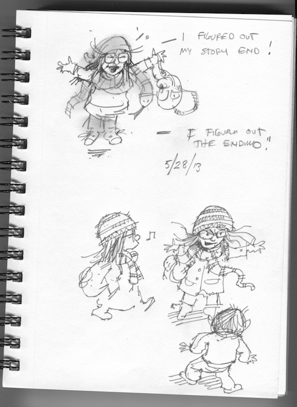
These (above) are sketches I had done to further explore Missy’s “snake eye” smack down with a wild snake scarf. They were put aside when I created the animated sequence on the right hand page.  (Can you see  the little black arrows above? I use these all the time as a note to my self  indicating which sketches on the page I like and want to remember.)

Snake-eyes-7b

Above is a close-up of the drawing I liked the most. You’ll see later in the third and final part of this blog – Miss Brooks Story Nook, Part three – The Color Art – this particular drawing, and the one of Billy, are not wasted. Due to another late text change, they end up being used, almost untouched, for the new climax scene following the snake-eye spread.

More on the art for this book: Miss Brooks Story Nook – book page.

Miss Brooks Story Nook, The Art – Part One

Miss Brooks’ Story Nook – the art, part 1

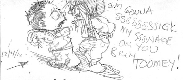
missy 2 jacket finalbIn my new book, Miss Brooks Story Nook, (written by Barbara Bottner) the illustrations took me over a year to finish. Which is not unusual for me. Why so long? Well, I’m slow, for one thing. But in general the work of illustrating a picture book is not constant. There are several stages you need to go through, from rough sketches of characters, layouts, final sketches, line drawings, then color, with breaks in between for the publisher, (editor, designer), and author to review what I’ve done, and send back comments, which I will listen to, or, ignore. They will listen to me and agree or disagree, and so on, back and forth, until we have negotiated the final look of the book.  Sometimes a decision is made by the author or editor, based on what I’ve drawn, to change the text. And sometimes a change is made to the text while I’m drawing. This all adds time.  So where do I begin? First I read the latest text over and over. Sometimes the editor sends just the written text, and sometimes the text is roughly positioned on layouts in the chosen typeface, as it might appear in the final book. This is helpful as it gives me an instant idea of how much room I have for art, and how the editor sees the page break down. This may remain unchanged, or, more likely, I will change things around a bit. For example, look at a spread below, where the main character, Missy, is staring down her nemesis, a boy named Billy, giving him, as the text states, her best “snake eyed” look. Missy book nook054b I almost always begin the sketch process right on the print-outs of the text layouts. As you can see above, I’m already working on ideas. This is a character I’ve drawn before so I did not need to completely re-create her for this book. The hair, glasses, overalls and stripe hat are a carry-over from the previous book. Missy-BillybNext I move on to sketch books, working at home, or in coffee shops, creating the characters first, then thinking about different scenes each character must “act out”. You can see the date of the above sketch of Missy and Billy, when I began the process – over a year and a half from the book’s publication date of Aug. 2014. This drawing (above) is one of the first sketches I did for this book. This seemed like the pivotal scene of the book, so I’m focusing on it. I still love this drawing, and as usual, I seldom get as good, and as fresh a drawing in the final book as I get in the first few moments of visualizing a story. Sigh. Snake eyes4b Missy book nook014b


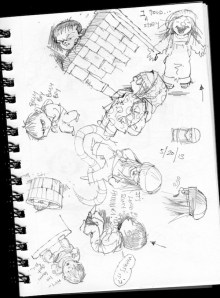
Above (left) is the original sketchbook page and the detail on the right of Missy in the “snake Eye” scene. As you can see, I work on many ideas at once. So only one small drawing on this page is from this scene. Notice the unused raincoat outfit for Missy. I love the coat, but there was no room for it. Below I’m trying to visualize the “camera angle”. Notice I’m playing around with the idea of a long winter coat and scarf for Missy. The scarf acting like a kind of snake. Below that I’m developing the idea further but this actually will be the blueprint for the next page, due to changes in the text.

Missy book nook022b Snake eyes 5b               Missy book nook009b Snake eyes 2b

Miss Brooks bw scans001b Snake eyes b Above is a further refinement of the actual image to be used. Focus being on face front, and the view point of the eyes. Below you can see how I developed a new layout with a focus on the eyes/faces of both, in a cinematic “animated” panel sequence for the right page of the spread and a scene, (still desperately trying to get in that raincoat on the left). Changes like this often occur as the text changes because each new spread layout is considered as a whole. And there were more than the normal amount of text changes in this project. Miss-Brooks-Book-Nook-12b(Below) I went back to a face-on Missy on the bottom left, and fooling around with the idea, ultimately rejected, of her wearing a different hat than that in the first book. Also see refinement in the sequence of the two staring each other down… Miss-Brooks-Story-Nook-30-31flatbMiss Brooks final line 009b And here is the final BW pencil drawing for this spread. Notice the stripe hat is back but she is still in a long coat – which will change before the final book is printed, as will the drawing of Billy… More on the finish art in The Art – part 2…

Dogs and Kids….

MarieLouise-Fitzpatrick1

Oops! Is it Tuesday again? Forgot to prep a blog so here are some sketches from the week gone by. Dogs and kids spotted about the village, made with whatever pen and paper was to hand. I really shouldn’t draw sketches of possible child characters on random manuscript pages because then I can’t find them again.

MarieLouise Fitzpatrick3

MarieLouiseFitzpatrick4

Note to self: start carrying a notebook again.


Stone Bouquet

IMG_0973


It’s hard to visit a Wicklow beach without coming home with pockets full of stones! The colours and patterns are so lovely. Have close look at these groupings – click & scroll on for larger images – some of the pinks and oranges and blues are just stunning.


And sometimes the shape is what catches your eye…

IMG_0975

Streetcar Bouquet

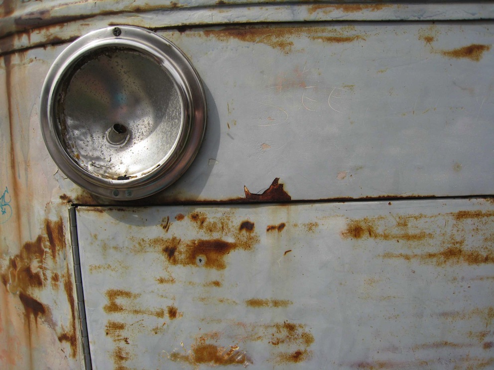
The Belugas are Watching 1This bouquet of colour is all from one source – a streetcar in Brooklyn which has definitely reached the end of the line. As the paint peels and rust blooms its surface has become a beautiful abstract of grey-blues, pinks, mauves, with splashes of wine-stain red. If ever I want to paint poignancy, these will be the colours I reach for.

In one picture you’ll find a message, a declaration of love part scratched, part written into the paint. Is it the work of two hands? If so, which bit was written first – the half-hearted or the effusive? The resulting equivocation seems at one with the colours of this vehicle which once traversed the city and now sits decaying into an accidental art piece .

A click will give you a large version of each photo – including the one with the message.

On Friday, a stone bouquet

Autumn Bouquet

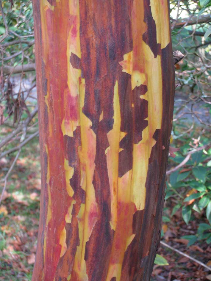
Bark

We often use hot colours in illustrations to make something stand out. You know how it works – cool colours recede, warm colours jump forward. Think of Spielberg using the child in the red coat in his black and white film, Schindler’s List, or of paintings of pastoral scenes which use a red roof or a yellow dress to draw your eye.

Sometimes it’s great to really go for it and use loads of hot colours in one image, or even throughout a whole book. These are the colours of powerful emotions; I used them throughout I am I, which is a story about anger and violence. The  palette for it is based on photos I’d taken in Australia’s Red Centre, and Andalucia. Nature is definitely the best starting point for figuring out how to handle fizzing reds, clashing purples and fiery oranges, without ending up in a complete mess!

These photos were all taken in Mount Usher gardens where the gardeners are masters of colour mixing. Click on them for full images.

Tuesday’s bouquet of colour will be from a… street car.

Brooklyn Bouquet

wall-abstract-2 The first of four colour ‘bouquets’.

When we start illustrating a new book we need to chose a palette. We go looking through favourite picturebooks and art books but we also hunt through our photo files. We are always on the look out for colour combinations – harmonious, vibrant, brash, soft – and we often take photos purely for colour. Nature is a great source – obviously – but cities yield  great colour combos too.

Here is a bouquet from Brooklyn.

Click on the images for a closer look at the colours; that urn has mustard peppering its rose pink…

On Friday’s post, an autumn bouquet.

Teeny Tiny Ting


Book

I spotted this tiny handmade book necklace online; I thought it would be nice to wear to book events. When it arrived and I held it in my hand, it occurred to me I could actually draw tiny pictures in it…I drew one and got Michael to draw a couple. When the Emberleys were visiting I asked Ed and Rebecca to add something. Since then I’ve asked several  illustrator friends to draw in it, so now its pages are almost filled with teeny illustrations.

Everyone I ask has the same reaction. They stop – blink – think! It takes a bit of refocusing and mental rescaling to draw something on this tiny canvas.

I was cheeky enough to ask Jim Kay and Mo Willems to draw in it when I attended talks they gave and have every intention of being cheeky a few more times until every page is illustrated – there are a few Irish illustrators I’ve yet to nab. My little necklace has become a favourite treasure – here are some of the images. Look how HUGE my fingers are; these are TINY images!

You can click on any illustration for a larger image, then scroll/click on side to look at the next one, and illustrator’s name should appear too.

All these little illustrations are reproduced with permission and are © of named illustrator.